How choosing a tiny app icon turned into a surprisingly long debate — and why asking teenagers turned out to be a very good idea.
Six Icons, One Winner, and a €5 Bet
How choosing a tiny app icon turned into a surprisingly long debate — and why asking teenagers turned out to be a very good idea.
You wouldn’t think choosing an app icon would be particularly difficult.
It’s a little picture. It lives on your phone. People tap it. How complicated can it be?
Quite complicated, apparently.
Too many cooks, too many icons
When we started designing Jybbo’s app icon, everyone had an opinion.
Some wanted something clean and professional. Others preferred something playful. Some liked a recognisable letter J. Others argued for something more abstract, symbolic or characterful.
And every time we thought we were getting somewhere, someone would produce an entirely new design.
Sometimes it was better. Sometimes it was worse. Sometimes it was exactly the same design in a different colour, which somehow made everyone reconsider their previous convictions.
We also discovered that there’s a considerable difference between a logo that looks fantastic on a large computer screen and one that works as a tiny icon surrounded by 47 other apps on a teenager’s phone.
Intricate details? Beautiful at 500 pixels. Completely invisible at 50.
We discussed. We compared. We refined. We made more versions.
We were getting very good at having opinions about app icons.
We were getting considerably less good at choosing one.
Enter the actual users
Eventually, we decided to try something radical: ask the teenagers who would actually be using Jybbo.
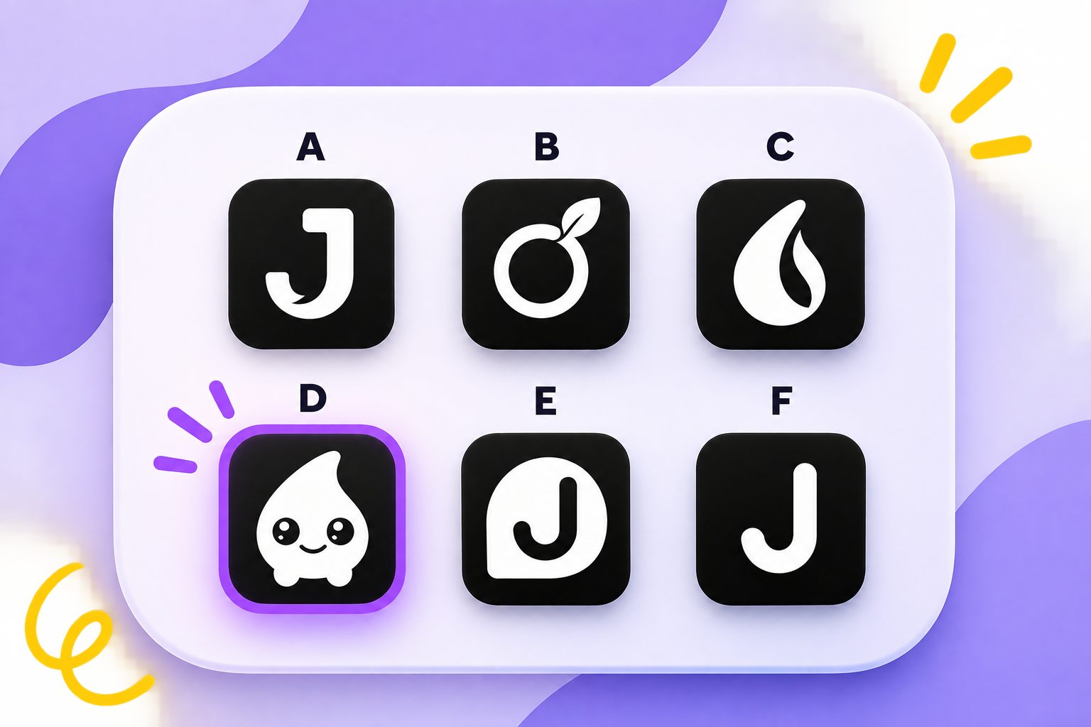
We narrowed the contenders down to six designs, labelled A through F, and stripped them back to black and white so the colours wouldn’t influence the result.
Our therapists at the clinic then asked young people which icon appealed to them most and which they thought would be easiest to recognise and find on their phones.
Simple. Sensible. Possibly something we should have done several meetings earlier.
The €5 bet
Now, as Jybbo’s Product Owner, I had a personal favourite.
D.
The little round character with the big eyes and tiny feet.
I liked it immediately. It had personality. It was friendly, memorable and unmistakably different from the usual assortment of abstract healthcare logos.
There was just one problem.
I was convinced teenagers would find it too childish.
After all, teenagers tend to have fairly strong opinions about being treated like children, and I imagined our little smiling blob might not survive their scrutiny.
One of our therapists disagreed.
In fact, she was so confident that she bet me €5 that the teenagers would choose D.
I accepted.
And the winner is…
D. With 75% of the votes.
Not a narrow victory. Not a complicated tie requiring another round of discussions.
Three quarters of the young people who took part chose the little smiling character.
The therapist won her €5.
And I was reminded of an important product-development principle: what we think our users will want is not necessarily what they actually want.
Of course, one small preference survey doesn’t settle every design question. But it gave us a much clearer direction than another afternoon of internal debate would have.
And perhaps that’s the more interesting lesson.
We can spend hours discussing whether something feels too childish, too serious, too playful or too unconventional. But when we’re designing for young people, their opinions deserve rather more weight than our assumptions about them.
So that’s settled. Right?
We have a winner.
D is friendly, distinctive and apparently rather more popular with teenagers than I gave it credit for.
The team can finally move on to other things.
Except…
We still need to agree on a colour.
And as we’ve already established, changing the colour of an icon can make everyone change their mind about the entire design.
So if anyone needs us, we’ll be looking at approximately 37 subtly different shades of purple.
Maybe we should ask the teenagers again.
Leave a Reply